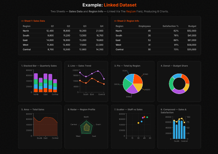
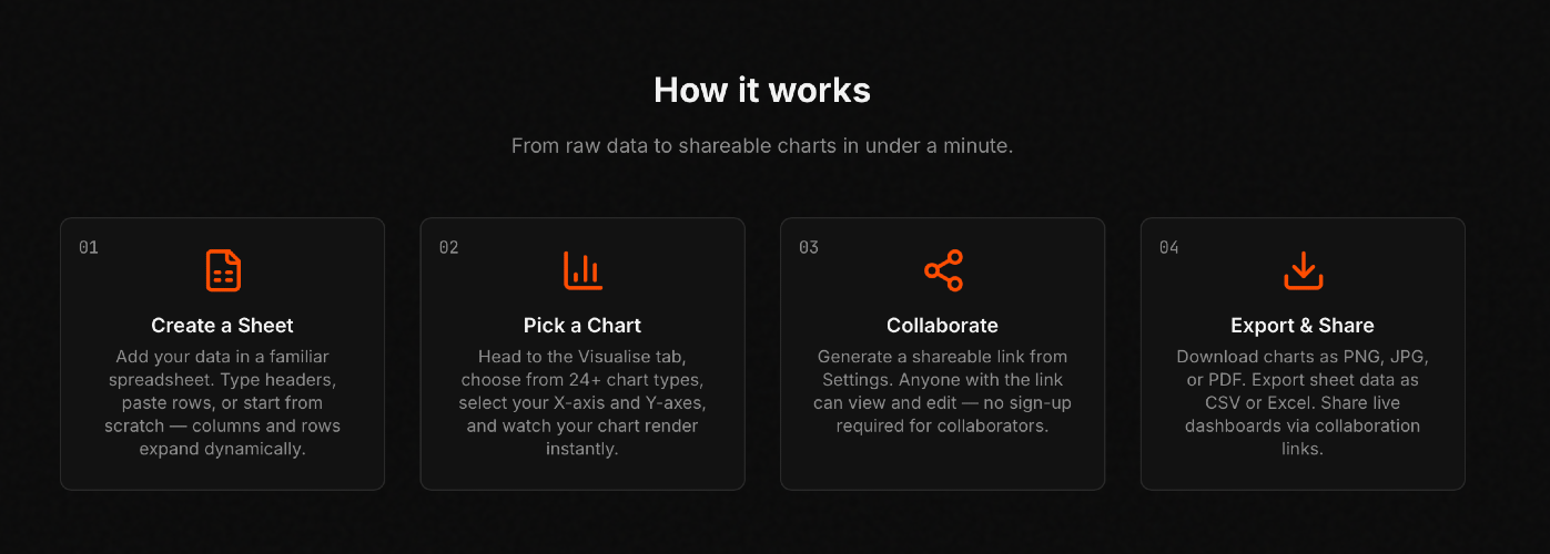
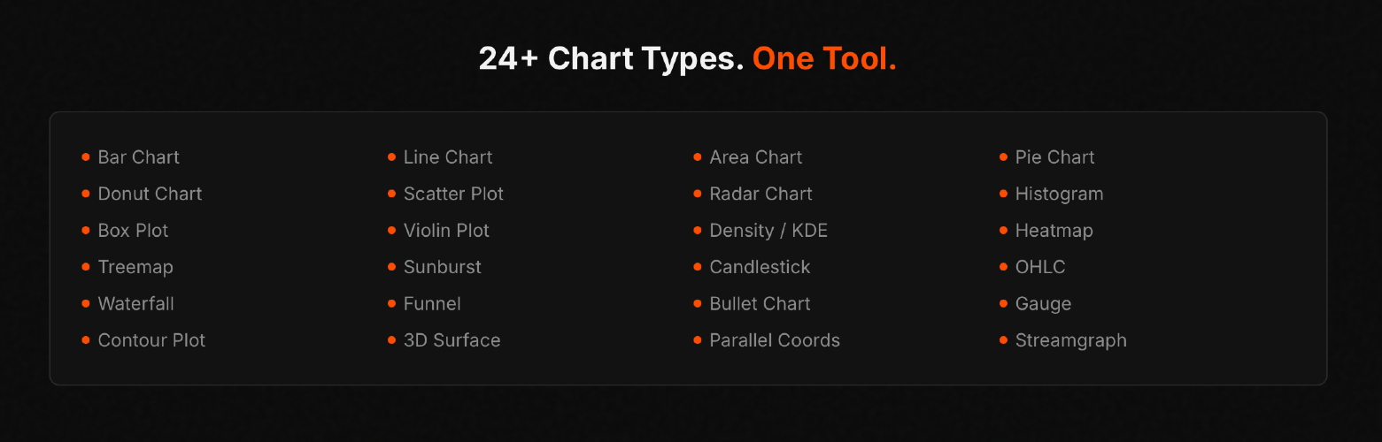
Polyform — the modern way to analyse and visualise data It lets you edit data just like a familiar spreadsheet, while instantly visualising it across 24+ beautiful chart types at the same time — bar, line, pie, scatter, radar, heatmap, candlestick, waterfall, gauge, 3D surface, and many more. Key highlights: Change any value and watch your charts animate instantly — no refresh, no lag. Connect multiple data sheets (e.g., sales + regions) and create combined visuals in one chart. Sign in and start working immediately. Everything lives in the cloud. Generate a shareable link — teammates can view or edit without signing up. Charts as PNG/JPG/PDF, data as CSV/Excel, or full dashboards. Add rows/columns on the fly, custom color palettes, link locking for safety, and financial/KPI charts built-in. No plugins. No complex setup. Just powerful, real-time data storytelling.
SponsoredGuest Post Watch:
Protect your paid backlinks Automatically. Track, monitor, and enforce backlinks you pay for or exchange.