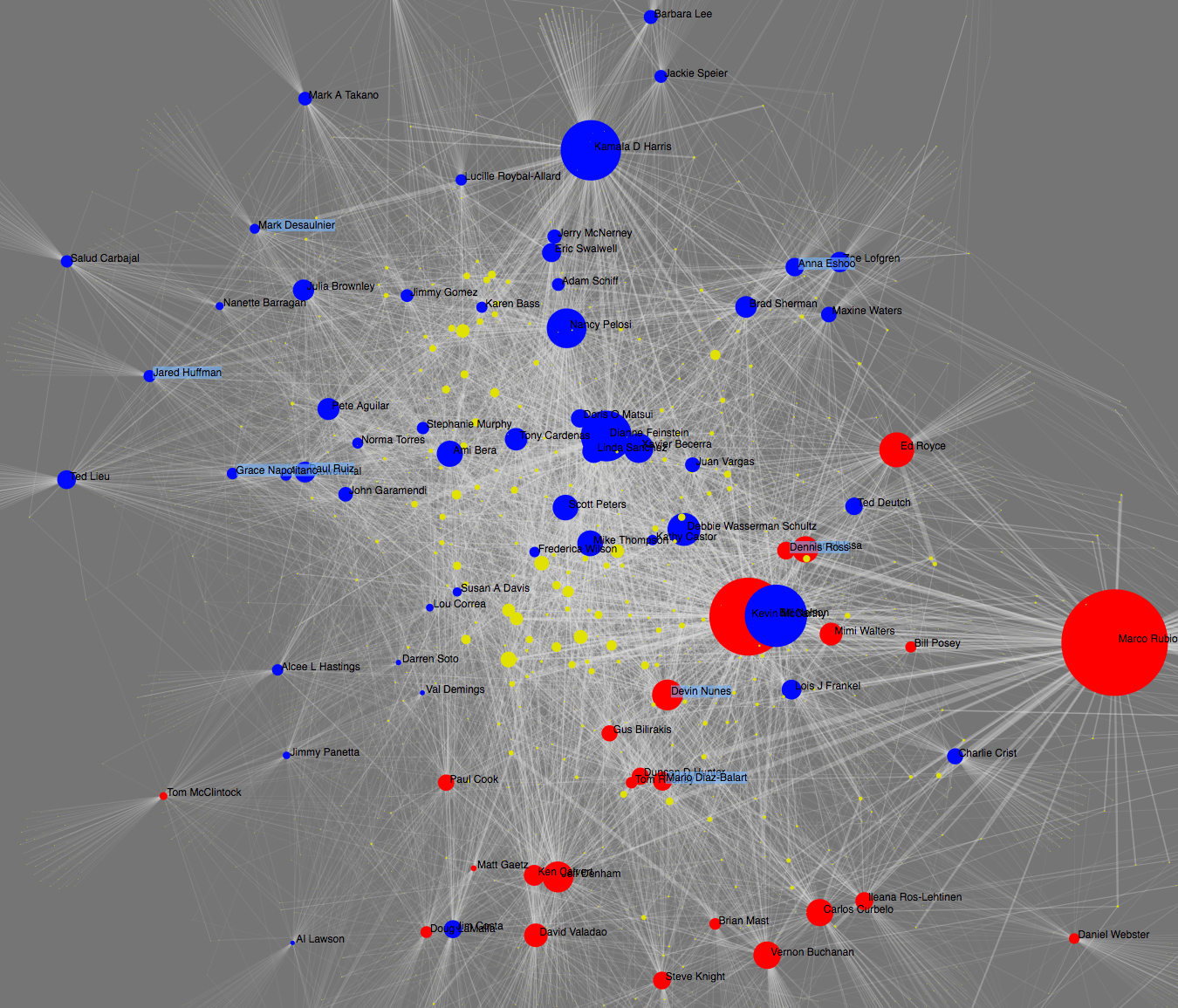
The 2016 campaign contribution data is from opensecrets.org. In the left pane, you can select the state(s) of interest to be graphed. Currently, I’m graphing both Senators and House of Representatives. I may provide a way to segment the two in the future. A blue circle denotes a Democrat legislator while a red circle denotes a Republican. Yellow circles are donors. The size of each circle represents the total dollar amount, either outgoing from a donor or incoming to a legistator. The width of the link between two nodes represents the amount given from that donor to that legislator. Clicking on a circle will display the dollar amount in detail. The results will be sorted from highest to lowest. One thing worth noting is that I didn’t group the legislators in any way. The connectivity between the nodes is the only determining factor when it comes to grouping.
2016 campaign donation viz
D3js data visualization on 2016 campaign contribution done in clojurescript
Published At