Top Transactional Email Templates and Examples
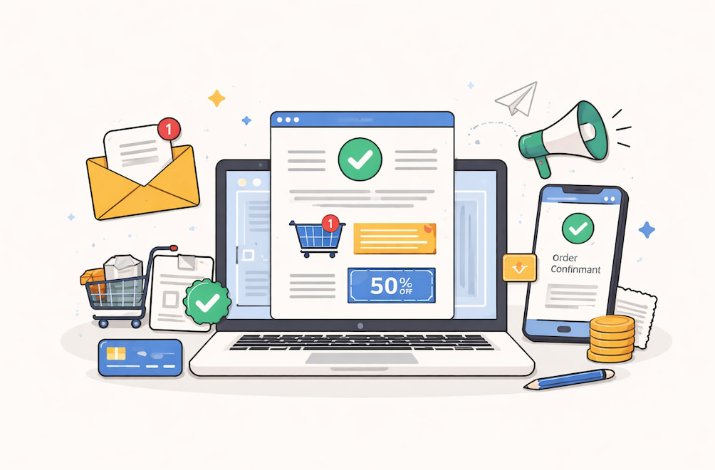
"Congratulations, your order is on the way!" – that short message is opened more often than any marketing newsletter you'll ever craft. Transactional messages – order confirmations, password resets, and shipping alerts – are triggered automatically by user actions and, according to SQmagazine, rack up open rates in the 60%-80% range, far above the global promotional average. Their purpose is functional, but that doesn’t mean they have to feel robotic.
For product teams and email marketers, the real tension is speed and clarity versus brand voice and incremental revenue. Users await near-instant reassurance; the business wants retention and cross-sell opportunities. When the balance is right, transactional emails become silent growth engines. When it’s wrong, support queues fill with “where’s my stuff?” tickets.
In this deep dive, we’ll walk through eight high‐impact transactional email templates and the decisions behind them.

Why Transactional Messages Deserve Product-Level Attention
Most companies treat marketing emails like shiny billboards and transactional emails like utility bills. That mindset wastes the attention you’ve already earned. Let’s unpack three reasons these messages punch above their weight before we get tactical.
Trust Compounds in Moments of Vulnerability
When a user clicks “Pay now” or “Reset password”, they’ve ceded control and are waiting for confirmation. Swift, precise communication here solidifies trust far more effectively than a slick brand video. Miss the moment, and confidence evaporates.
Engagement Metrics Start High and Can Go Higher
The baked-in relevance of transactional sends means baseline engagement is already strong. The job is to preserve that advantage: keep deliverability pristine, load critical info above the fold, and nudge users toward the next logical action (track order, invite teammate, rate product).
Revenue and Support Are Two Sides of the Same Coin
A lucid shipping update removes friction from the post-purchase journey, cutting WISMO ("Where Is My Order?") tickets and freeing agents to handle edge cases. The same email can quietly showcase a complementary product or loyalty program, adding incremental revenue with zero extra sends. Optimization is therefore a bottom-line activity, not a "nice to have".
The Core Library: Eight Templates You Can Plug-In Today
Below, we group the eight highest-leverage triggers into three expanded clusters: Purchase Flow, Account Security, and Subscription Lifecycle. Each cluster includes at least one concrete transactional email example along with design, copy, and data tips. This structure lets you zoom in on where your own volume concentrates.
Cluster A: Purchase Flow (Order Confirmation, Shipping Update, Invoice)
The purchase arc generates the lion’s share of transactional traffic for e-commerce and many SaaS add-on marketplaces. Let’s examine one detailed template before touching on the others.
A-1: Order Confirmation – Your Immediate "We Got You" Reply
Nothing terrifies a customer like silent limbo after checkout. An optimistic confirmation is reassuring and gives after-sales expectations.
Copy voice: warm, brief and loaded with necessities.
Subject line ideas:
- "Thanks, Maya! Your order 7821 is locked in."
- "Receipt & next steps for your climbing gear."
Essential blocks explained:
- Header with logo plus optional order-progress breadcrumbs. Shoppers glance here first; the visual cue that the order is “Processing” calms nerves.
- Hero line. “Received order: estimated delivery on 8-10 Jan.” Note the date is specific and is written above the fold in order to minimize tracking clicks.
- Itemized table: product thumb, variant, qty, price, subtotal, tax, shipping, total. A monospace font on number columns prevents accessibility problems with screen readers.
- Dynamic CTA: “Track your order” if a tracking code exists; otherwise, “Manage order”. Resist the urge to upsell here. Clarity first.
- Support sentence and plain-text fallback: “Need help? Reply to this email or call 1-800-CLIMB.” Placing support options inside the email slashes ticket handle time later.
Design hint: Keep a single-column layout that collapses gracefully on mobile. Edge-to-edge tables scream “auto-generated”, so provide generous white space and subtle borders to feel human.
A-2: Shipping Update
As the order leaves the warehouse, customer excitement peaks. An infographic-style progress bar (Picked → In Transit → Out for Delivery → Delivered) provides a quick dopamine hit. Embed the live tracking link once, not five times, to avoid spam triggers. You can safely include a cross-sell module here – think “Need carabiners for that harness?” – as long as it’s visually secondary.
A-3: Invoice or Payment Receipt
Compliance demands readability. The accounting departments should be served with PDF download links, but the key totals must be mirrored in the body to appeal to mobile skim-readers. In case you are serving the EU, provide VAT information.
Minor victory: tag the subject with invoice number (“INV-1449 Receipt of Jan 2026]”) – during tax time, customers can search their inbox by this field.
Cluster B: Account Security (Password Reset, Verification)
People may forgive a marketing typo, but never a broken password link.
B-1: Password Reset Blueprint
Goal: send a single, safe call to action in a matter of seconds. Here’s a short but thorough transactional email template draft you can adapt.
- Title: “Reset your password” in a 24 px bold face. The brain decodes big text first.
- Instruction line: “Click the button below within 60 minutes to choose a new password.” Timebox calms anxieties about link theft.
- Button: full-width, brand color, descriptive label (“Create new password”). Link includes a JWT token with an expiry parameter.
- Secondary note: “If you didn’t request this, no action is needed.” Non-technical users worry they’re hacked; explicit reassurance helps.
- Security information: device, browser, city (based on IP). Transparency lessens the support escalations.
Adding the validity of the email with the embedded email sent by notify.example.com in the footer gives the email a solid foundation.
B-2: Account Verification/Double Opt-In
This is when you get an opportunity of sprinkling a bit of personality without damaging clarity. A humorous microcopy message, i.e., "one click and you are a member of the crew", can make them fall in love, yet one should always remember to make the copy of the button literal (“Verify email”).
Hidden gem: below the fold, list two immediate in-product actions unlocked by verification. People click more when they know the reward.
Cluster C: Subscription Lifecycle (Payment Failure, Plan Confirmation, Farewell)
These messages hit existing customers, where churn or expansion lives.
C-1: Payment Failure / Card Expiry: Empathy First, Urgency Second
Frame the problem as a mutual glitch: “We tried to renew your Pro plan today, but the card on file needs a quick update”. Then spell out consequences (“Your workspace stays active for 7 days; we’ll retry automatically”). Provide two CTAs side by side: “Update card” (primary) and “Contact billing” (secondary).
Data tip: including the last four digits of the failing card helps customers locate the correct one in multi-card wallets.
Little-known deliverability hack: add the business address in the footer even though CAN-SPAM doesn’t require it for purely transactional content. Major mailbox providers award trust points for transparent senders.
C-2: Plan Confirmation & Onboarding Kick-Start
Customers upgrading from free to paid often ignore marketing onboarding flows. Put the checklist right inside the confirmation email:
- Step 1: “Invite your team (you get 5 free seats).”
- Step 2: “Install the desktop app for offline access.”
- Step 3: “Book a 15-min success call.”
Each checklist item doubles as a progress tracker and drives Day-1 activation.
C-3: Farewell/Account Deletion Confirmation
Though sad, this email still influences lifetime value. State clearly what data was deleted and the timeframe for backup removal. Provide one reactivation link in 30 days. Multi-page exit surveys do not work on this emotional level as compared to one-question exit surveys.
Always keep in mind: do not put promotions down on a deletion confirmation – it ruins the ethics.

Shipping and Scaling: From Figma to Inbox
By now, you have skeletal layouts and copy angles. Let’s talk operations – the nonglamorous details that make or break delivery. This is where email API integration becomes the unsung hero.
Choose a Dedicated Transactional Subdomain
Separate streams (notify.brand.com versus promo.brand.com) achieve two things: they isolate reputation damage when a promotional blast goes south, and they simplify SPF/DKIM alignment. If you’re migrating legacy templates, start with lower-volume triggers like account verification to warm up the domain gradually.
Email infrastructure is a complex asset you may either own or rent as a service. Build or Buy?
- In-house MTA provides the greatest control, but needs 24/7 maintenance.
- Specialized ESP with a strong API (e.g., UniOne, Sendgrid’s transactional tier, etc.) shortens go-live time. Evaluate synchronous response times because password resets can’t sit in a queue.
Regardless, the instrument has real-time dashboards for delivery rate, bounce classifications, median time to Inbox, and failure alerts. Piping webhook data into your logging stack (Datadog, Grafana) means engineering can debug in minutes instead of days.
Failover and Idempotency
Suppose your primary provider experiences latency spikes on Black Friday. Use idempotent request IDs so you can send the event to a second ESP without creating duplicates. Store a hash of the payload to be safe.
Accessibility, Dark Mode, and Testing
Dark mode isn’t a novelty anymore; it’s the default on iOS Mail. Test templates in light and dark variants, focusing on contrast ratios for body text (WCAG AA 4.5:1 or better). Litmus and Email on Acid remain the quickest way to preview 90+ client/OS combos, worth the cost for transactional templates that persist for years.
A/B testing remains your friend, but be sure to constrain variables. Change only one element: a subject line personalization token or a CTA color per test cycle. Transactional volume is often lower than promotional, so you’ll need longer windows for statistical significance.
Conclusion: Turn Passive Emails into Active Brand Assets
If you skimmed straight here, remember this: users open transactional emails because they need something right now. Meet that need fast, and you earn the right to guide them toward the next step, whether that’s tracking a delivery, inviting a colleague, or sticking around for another billing cycle.
Start with the highest-volume template (usually order confirmation or password reset), apply the principles in our expanded clusters, and instrument clear metrics before you hit send. Once the baseline is performed, layer in subtle brand flourishes and contextual cross-sells without ever compromising clarity.
Treat transactional email examples as part of the product, not a postscript. Do that, and these quiet messages will keep your customers and finance team happy long after the big campaigns are over.